To say Tolles has had an impact in developing their communities in is an understatement. In all, Tolles can be credited with the ownership, development, or management of over a dozen of Northern Nevada’s most well-known pieces of commercial real estate.
Their portfolio includes chic shopping centers like the Village at Rancharrah and the Styx at Midtown, office buildings that have defined the city’s economic hubs, and enterprising industrial centers where names like Panasonic and Tesla keep the world turning.
In fact, for years they’ve been so busy developing projects for their investors and clients that the development of their own brand took a back seat. When they tried a brand redesign project, the results fell short of their expectations.
We were thrilled to get the chance to work with such a prolific team of developers and take the brand to a place that was as creative and thoughtful as they were.
"Lorem ipsum dolor sit amet, consectetur adipiscing elit. Ut elit tellus, luctus nec ullamcorper mattis, pulvinar dapibus leo.Lorem ipsum dolor sit amet consectetur adipiscing elit dolor"
John Doe
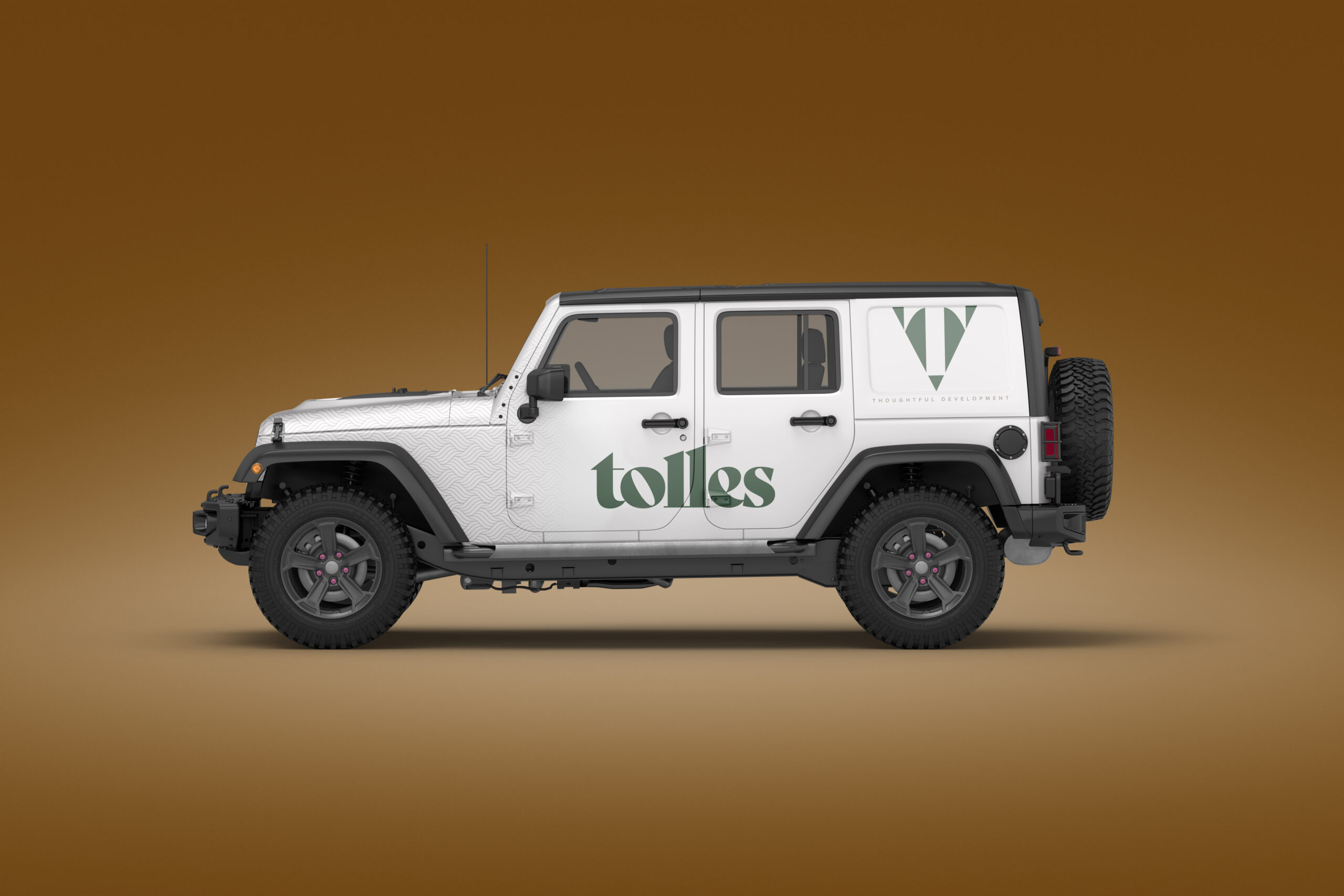
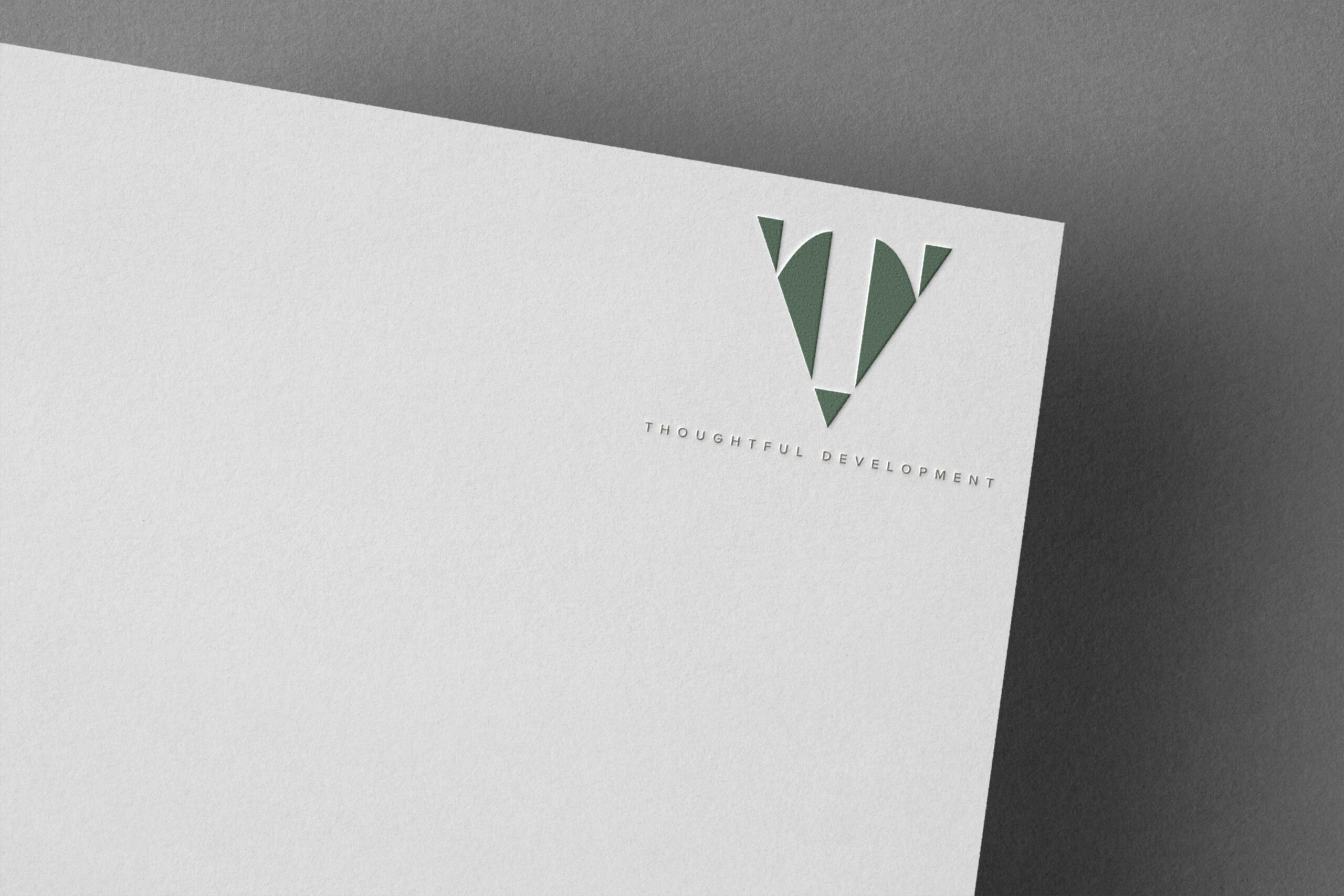
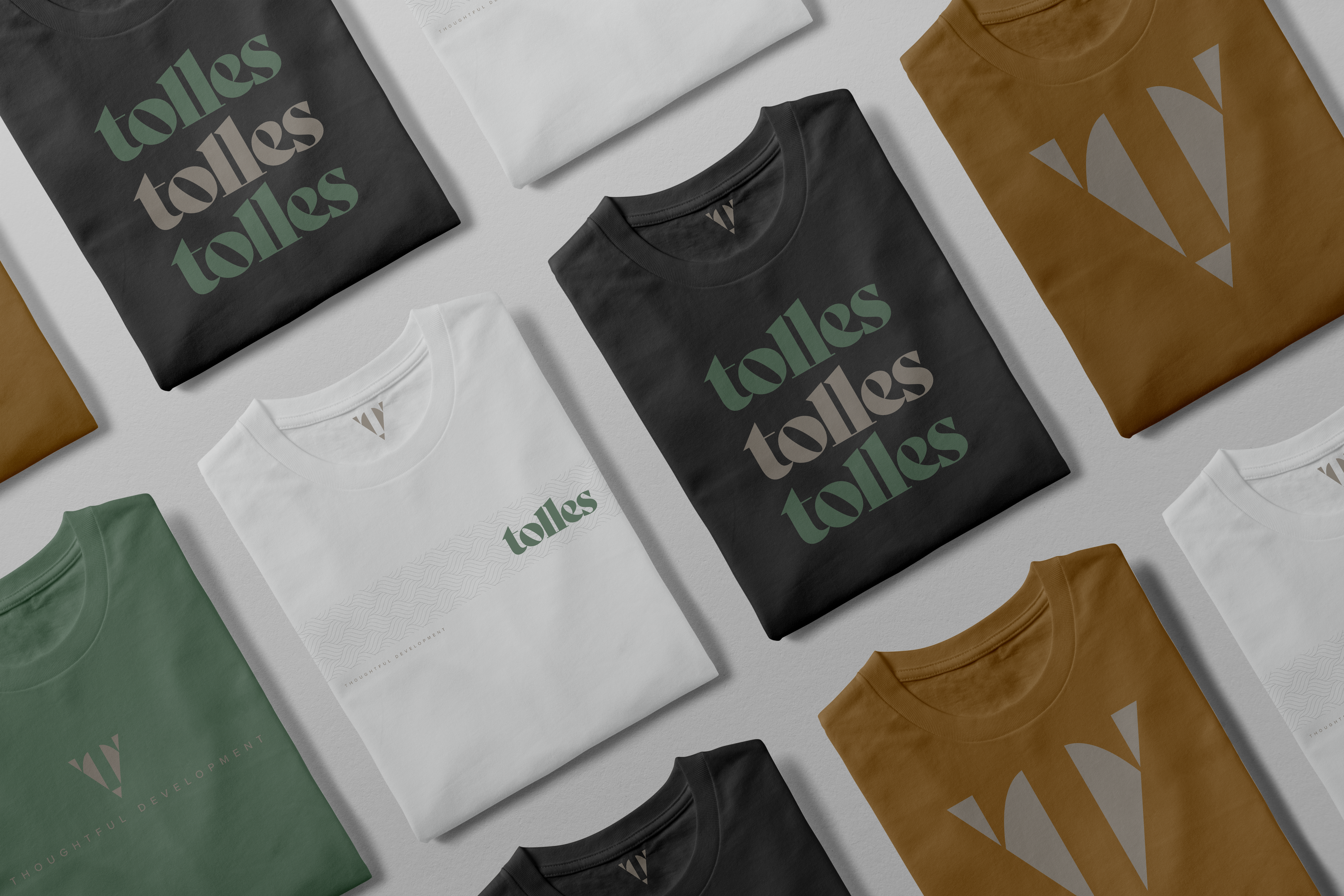
Objectives: Design a brand that the Tolles leadership team could identify with and be proud of.
Discover untapped principles behind the Tolles process and turn them into undeniable truths of the brand.
Build a verbal and visual style that matched the quality present in the Tolles portfolio of properties.
Design Thinking: We started with our proprietary brand discovery process, insightOUT™, to gather the thinking and insights that would take us to new territory with the Tolles team.
an all-day brand discovery session with nearly 15 high-ranking staff members, including B.J. himself. In this session, we noticed what really got the group fired up wasn’t so much the structures they built, but the people behind the scenes. The firm truly valued the partnerships they had built over the years and knew their most respected work came from their most respected clients. What they didn’t know was that you could build a brand around that idea.
Too many regional-sized construction companies focus on so many faceless benefits to their work. They talk about the product, about the budgets, about the speed. What they don’t talk about is the people you’ll work with if you hire them, and so we knew this was a bold, unique stance for Clark/Sullivan to claim.
Solutions: Although it’s a relatively fresh perspective for this sector, people-forward branding isn’t necessarily new to the rest of the business world. We really loved the word “partner” because it felt distinct enough to claim, but also because it implies shared success. As “The partner to build with,” Clark/Sullivan create a brand promise of collaboration and tailoring their services to a client’s needs.
“Clark and Sullivan” is a wieldy name to work with, so we experimented with various ways to truncate it, eventually landing on a backslash. Immediately, this takes a company name about two people and creates an ambiguous single name to represent the firm. The backslash also carries over into the icon abbreviation C/S, which creates space for the brand to expand in the future without either the “Clark” or “Sullivan” present in the company.
Challenges: Wrangling various offices and project teams to align with a new set of guidelines isn’t easy – the company proved that the first time around. This time, we formally announced the rebrand with a company event and had leadership from each of the offices express support for the new direction to employees at all levels. Involving entry and junior level staff members is a great way to garner support. Feeding them a slice of cake doesn’t hurt, either.
Favorite details: The obvious detail is the upward pointing arrow present in the icon. What might be less obvious is the thin right angle that creates a 3-dimensional building block stamped on the top with C/S. The strong stable elements lend themselves beautifully to patterns and other parts of the design system. More importantly, they’re a visual representation of Clark/Sullivan’s promise of a successful partnership.
Visual influences: Back in the day, Co-Founders Dave Clark and B.J. Sullivan painted their first fleet of trucks a pretty aggressive shade of raspberry. The Northern Nevada sun had other plans, though, and eventually faded them to an unforgettable pink that the company became known for.
With this in mind, we knew we didn’t have to play it safe with color choices. Ironically, that meant taking a leap with a sizzling “safety green.” We crafted something that would stand out on a job site and make this next fleet just as recognizable. The client wholeheartedly agreed.
Time constraints: 3 mons.
Specific demands: Make the new brand partner and future proof
Anything new: Focus on the people and partnerships rather than the products
Alternative approach: We were able to create a toolkit of base designs for the in-house marketing team using Adobe Creative Cloud.
Lorem ipsum dolor sit amet, consectetur adipiscing elit. Ut elit tellus, luctus nec ullamcorper mattis, pulvinar dapibus leo.

Learn More
Lorem ipsum dolor sit amet, consectetur adipiscing elit. Ut elit tellus, luctus nec ullamcorper mattis, pulvinar dapibus leo.

Learn More
Lorem ipsum dolor sit amet, consectetur adipiscing elit. Ut elit tellus, luctus nec ullamcorper mattis, pulvinar dapibus leo.
Learn More
Lorem ipsum dolor sit amet, consectetur adipiscing elit. Ut elit tellus, luctus nec ullamcorper mattis, pulvinar dapibus leo.