There are very few names that can claim as much of Northern Nevada’s homebuilding history as Fred Altmann. Fred was the first full-time custom home builder in one of Reno’s most well-known neighborhoods, Caughlin Ranch. By the mid 1990s, Fred had built hundreds of custom homes in and around Reno, Lake Tahoe, and Truckee.
His firm became known for two things: being the “design construction” company and bringing Tahoe quality, craftsman-style homes to Reno.
Objectives: When the team came to us, Fred had since rebranded Altmann Construction to DFAltmann. It was a move made with a lot of reasoning behind it, but without a lot of special attention given to their brand proposition and how that should be conveyed visually. The DFAltmann brand did not scream “luxury custom homes,” nor did it honor the pedigree of what people had come to expect from an Altmann home. The name, DFAltmann, also did not do the brand any favors. It wasn’t easy to say or pronounce, and it lent itself to some awkward mispronunciations like “default-man.”
Our job was to rediscover the principles that made Altmann a regional leader in the first place, then manifest them visually in a way that respects the beauty, craft, and attention to detail in their products.
Design Thinking: Like most of our comprehensive brand design projects, we began with our proprietary insightOUT™ brand discovery session with the Altmann team. These all-day sessions typically include a company’s founders, decision makers, and other key stakeholders in a round table discussion about the company’s past, present, and future. It’s a fantastic way to not only gain valuable insights from all levels at the company, but get them unfiltered in a 100% inclusive environment.
It was here we learned that there is an inherent artistic value in all of Altmann’s projects. This artistry takes the shape of thoughtful design touches that improve efficiency, aesthetics, or both. Even in their non-custom, residential developments, there was a tireless devotion to craftsmanship that made the typical homebuyer feel like they were living in luxury. It was clear to us that Altmann needed to be perceived as that luxury custom home builder, and that anyone lucky enough to live in one of their residential neighborhoods was getting a truly special home at an affordable price.
Solution: We live for finding that perfect combination of simple and bold; any brand that’s selling on a promise of luxury and pedigree should do the same. We knew we had to take the Altmann name to that place.
We started by reducing the Altmann brand to its simplest origins and using a similar, lowercase wordmark to years past. To add refinement and elegance, we chose a much thinner type and made a series of customized edits like longer l’s and t’s to resemble the mid century modern architecture that inspires the Altmann’s.
The plus sign is also drawn from the original logo, but again thinned and tilted up right to better resemble the works of Altmann and their influences. The symbol also allows Altmann to call out various sectors of their business in a complementary way without affecting the brand’s equity.
Challenges: Although this was a rebrand, we didn’t want to throw away every single piece of DFAltmann. There was equity and familiarity with the old wordmark and logotype – those things are always valuable to a brand. Bringing elements of the old brand to a place of restraint and luxury was fairly challenging, but it was an fruitful exercise with an end product that proved worth it.
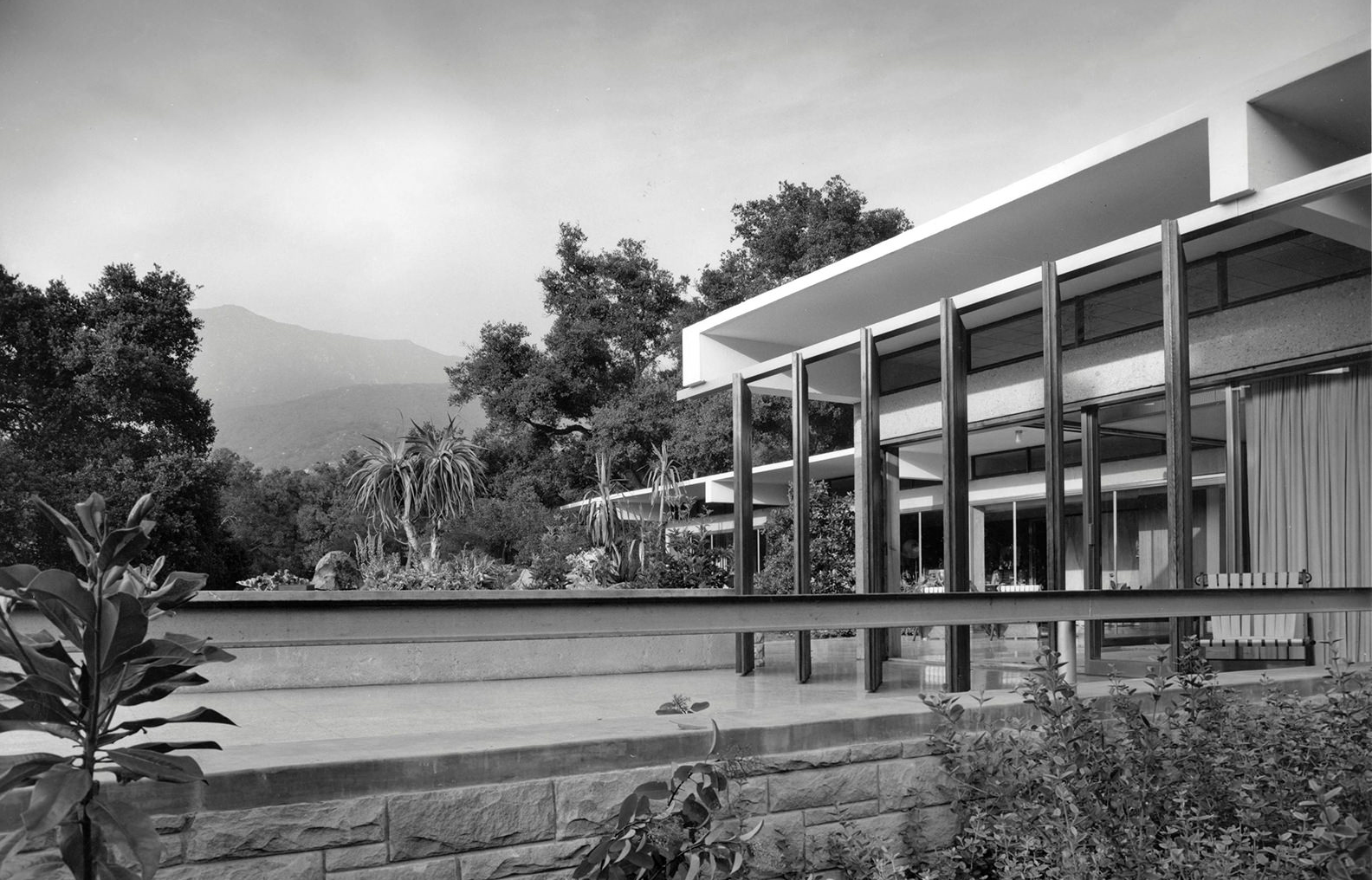
Visual influences: The base typeface used for the wordmark is called Neutra, which is based off of the handwriting of the famous architect, Richard Neutra. Neutra was known for incorporating long fine lines that often intersected in his work. The best example of this is the famous Tremaine House in Montecito. These same shapes and angles extended from the wordmark into the logotype, and then into the larger design system.
Favorite details: In our edits to the Neutra typeface, we elongated the lowercase l and t. Not only does this give the brand a subtle nudge further into luxury territory, but the two forms together also form that Neutra-inspired architecture on their own.
We purposely crafted our plus icon to be nimble. In the fine art world we’d call its application Neo-plastic. It’s built to extend and contract to fit whatever medium it’s used in and resembles low-slung or toweringly vertical modern architecture depending on the orientation.
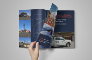
Logo design, brand identity, signage, and vehicle decals for Curtis Bros. Construction Inc.

At the intersection of purpose and play is this one-man-band who knows the power that fulfilling spaces can have. Oh, and gradients.
We took Northern Nevada’s leading architectural firm and rebranded it with a bold, thoughtful identity founded on the idea of connection.