Background: It’s not often we come across businesses who are as laser-focused in their purpose as Copenhaver Architecture.
Todd originally discovered us after attending the 2016 DICE Design Conference. He loved the interactive and unconventional attitude of the conference so much that it made him realize his own brand lacked its own unique personality.
When Todd approached us about developing and designing his brand for Copenhaver Architecture, we were impressed to find he had really done a lot of the early work for us. He outlined his ethos for us: to highlight the inherent uniqueness in every space with designs that unlock social interaction.
Objectives: Todd’s company purpose really resonated with us. There were a lot of USPs (unique selling propositions) apparent in just that single sentence alone.
To be “inherent” means to be deeply engrained as a characteristic. Todd believes that there’s deeper purposes behind each of the spaces he designs and his job is bring them to light in new and interesting ways.
Among his favorites: social interaction. He believes the spaces that bring the most out of us are the ones that inspire play amongst one another, whether that’s unexpected stadium seating or open layout commercial projects that create efficiency through enjoyment.
“I loved the conceptual nature of the design work for the conference, especially the website. I had never seen design do that, so I hired Stan and his team to do mine.”
Todd Copenhaver, Copenhaver Architecture
Design Thinking: Just like with any client, our first step was to fully develop the rest of Todd’s brand. His ethos was a fantastic start, but it only took us so far. We developed his brand pillars, mission statement, and his vision statement to cement the undeniable elements of his brand in writing.
With plenty of material to work with, we set out to capture the essence of his brand visually. The serious tones of “purpose” acted as the perfect balance to ideas like “play.” A sort of yin and yang of brand ideals that kept one another grounded in each other.
It sounds a little lazy, but to create “purpose” visually we relied on the disciplines of good design. We decided to root his visual identity in solid forms and sans serif type that would be both versatile and attractive in any medium he needed.
With much of the brand’s path decided, we still needed to find ways to include that “play”, that social interaction front and center in the brand. One way to do that is through color. Not only does color immediately make playful impressions on us, but it’s also a design element that punches above its weight class. Simply put: if we nail the color right, we knew we could make Todd’s one-man-shop seem like the one-and-only choice for design-oriented businesses.
Solutions: By the time we had even started designing anything, we had much of our path going forward figured out in two words. We landed on Copenhaver’s new tagline, “purpose + play,” as a succinct and semantically satiating way of distilling the original ethos he described to us down to its most essential parts.
From here, the identity began to take shape, starting with that most stable form of four equal sides. The words “Copenhaver” and “Architecture” are like one foot in and one foot out of the same hop scotch square, their chunky sans serif figures contrasting each other playfully along the border.
For color, we frankly couldn’t decide on any one shade over another. So we did the most playful thing we could think of and selected “all of the above.” We developed several different gradient choices, each more vivid than the last, to anchor the identity system going forward. This immediately made Copenhaver stand out in their region’s boutique architecture field with a distinctly artistic feel.
Challenges: If every designer had their way, every company name would be seven letters or less. Alas, Copenhaver came to us with 22, a fairly daunting task, but one that led to the elegant solution of anchoring the name to the base of the square. Doing this creates more head room in the logo’s overall form and distributes the straight length of the name evenly.
Favorite Details: We wanted to give life to the gradient idea in a way that felt playful and interactive. Multiple versions of the same business card are fun way to make that first impression more special for the receiver and more fulfilling for the giver. For digital mediums, we created a simple, but powerful animated .gif that transitioned between each of the gradient options seamlessly.
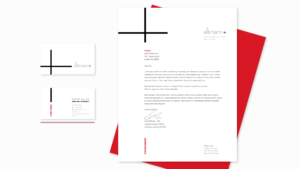
Lorem ipsum dolor sit amet, consectetur adipiscing elit. Ut elit tellus, luctus nec ullamcorper mattis, pulvinar dapibus leo.
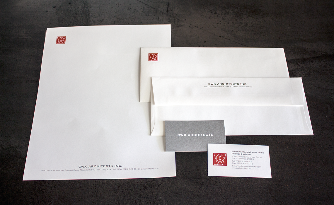
This pioneering custom home builder was known throughout the area for the artistry and craft present in all their homes. We gave them a brand that backed it up.
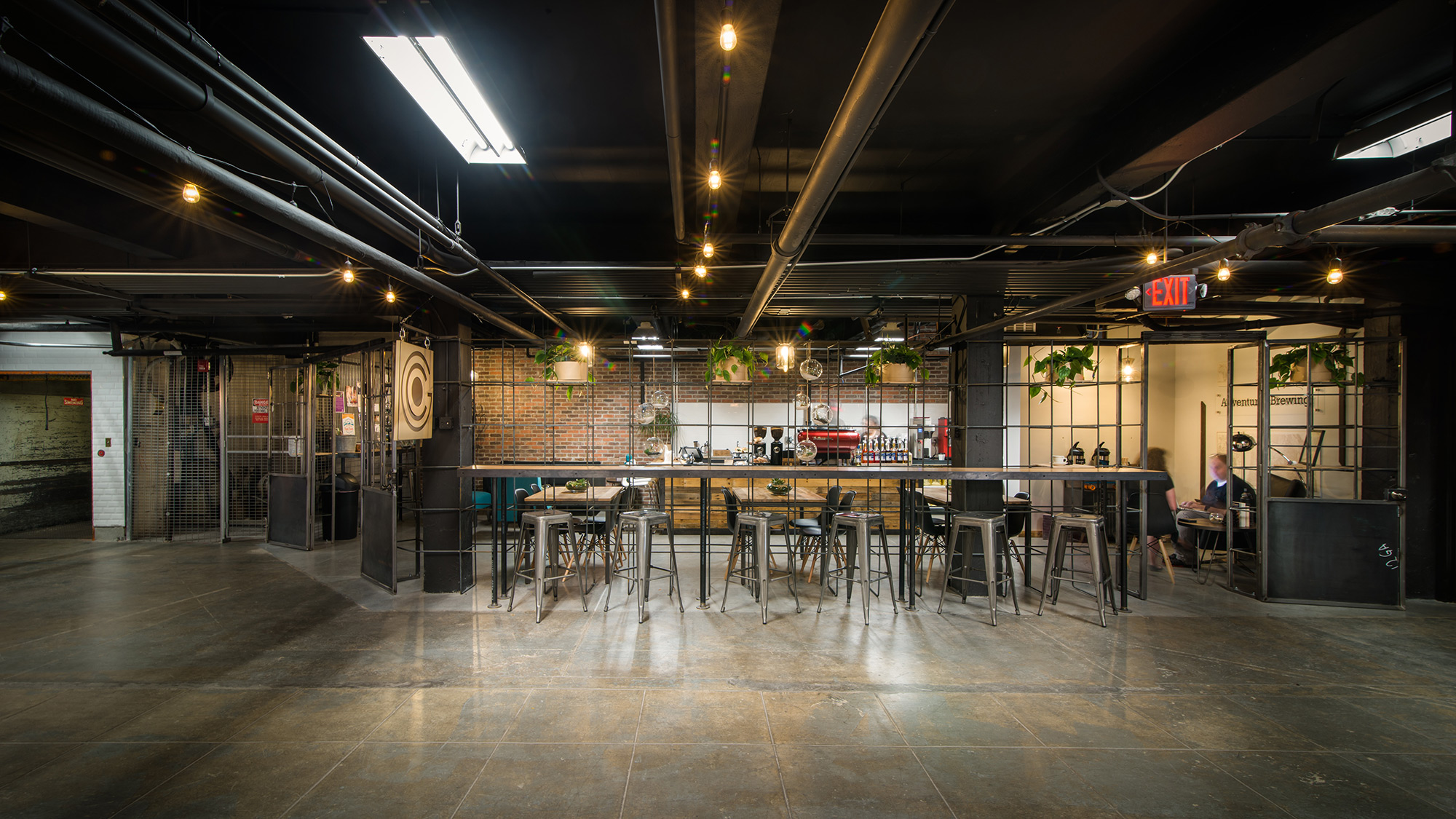
Leaning into the sweet spot between “heritage” and “contemporary”, this small-but-mighty firm discovers their love for legacy and community.
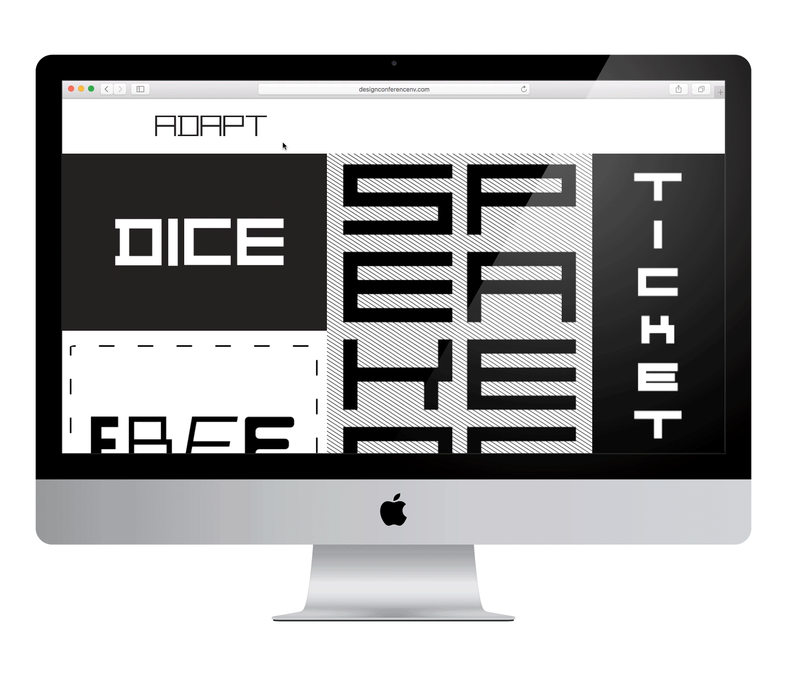
Northern Nevada’s premier multidisciplinary design conference gets a dynamic brand centered around a custom typeface that embodies what it means to Adapt.