Too often, small businesses don’t think they can benefit from a thorough brand development process. They see their size as a reason to cut corners and get straight to business, often missing out on a lot of profits and brain cells down the road had they only done the necessary groundwork.
Carlin Williams of CWX Architects was one of the smaller guys who got this. Instead of seeing his firm’s size as a reason to go fast, he took it as an opportunity to slow down and rebrand right.
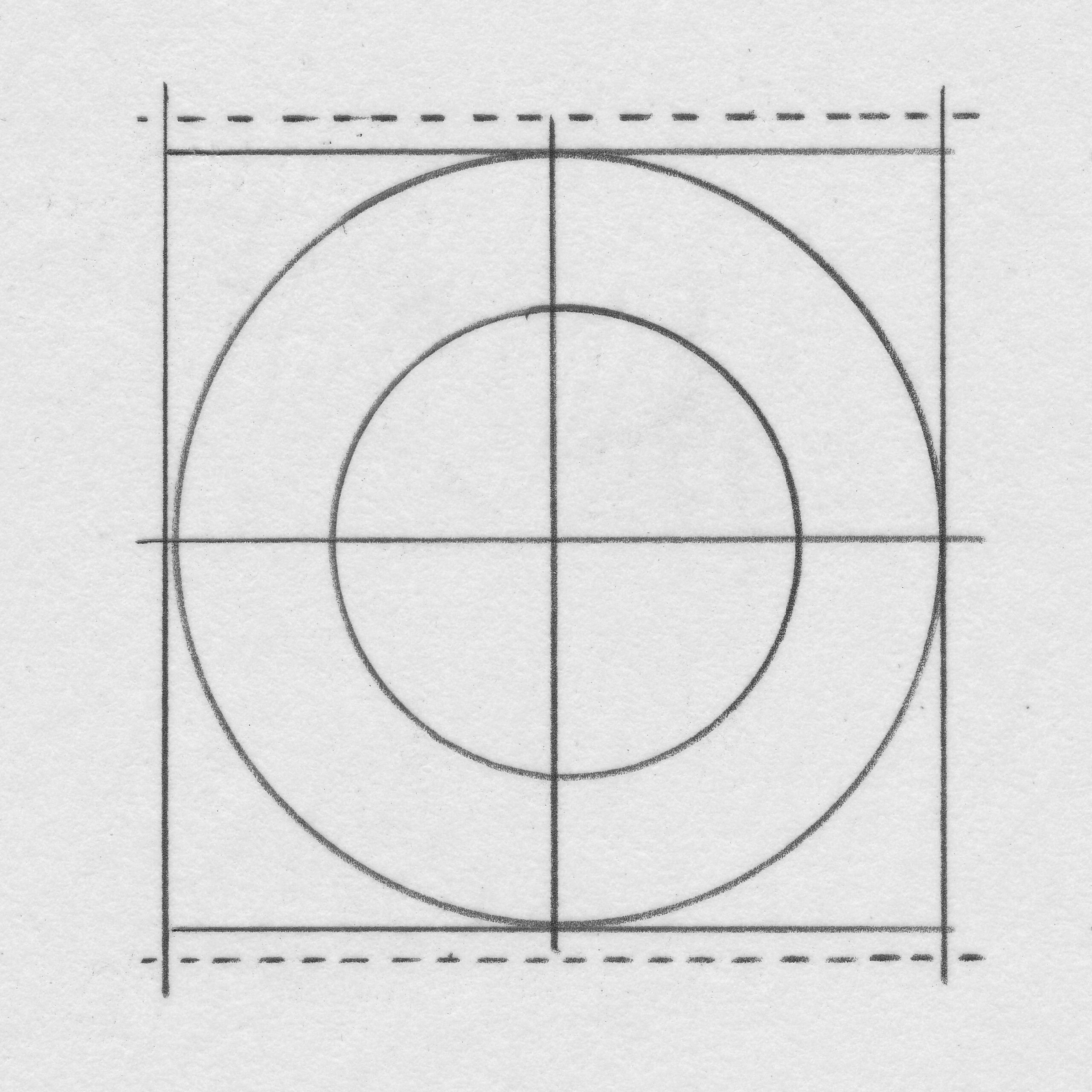
The brand is firmly rooted in respect for design history.
Some of the visual inspiration
“Hi Stan, Just wanted to let you know that we still love the design work you did for us.”
Carlin Williams, AIA Principal Architect
Background: Over the years, CXW architects had a collection of disparate logos and no defined brand. There was no company vision, and no mission statement on how to get there. When Principal Architect Carlin Williams and his team came to us, they felt the logo they were currently using was outdated and didn’t reflect their values, which were little more than internal thinking at this point.
Design Thinking: After an initial meeting, the team agreed that our insightOUT™ Brand Discovery would be a good step forward. Following a one-day facilitated brand development session, we delivered a new Mission, Vision, Brand Pillars, and a host of unique selling propositions for CWX.
It all starts with brand pillars. We came to the mutual agreement that CWX believes in:
Commitment: We are dedicated to incredible architecture to doing great work for our clients and community.
Design: Our architectural solutions are enduring. We value simplicity and timelessness. Simplicity is the ultimate mark of good design.
Details: Ludwig Mies van der Rohe said, “God is in the details.” We are thorough in everything we do to ensure the finished product is the very best it can be.
Innovation: We use original ideas and forward-thinking to solve our client’s real needs.
Our Team: We are focused individuals that form a special team capable of inspiring work.
With the groundwork laid, we had an arsenal of thinking to inform the next step of the brand design process.
Solution: You’d think most architects would be serious students of the past – not always the case. We discovered that Carlin was, in fact, an avid architectural and design historian. That told us we could tailor our solutions with subtle nuances that someone with discerning taste could appreciate.
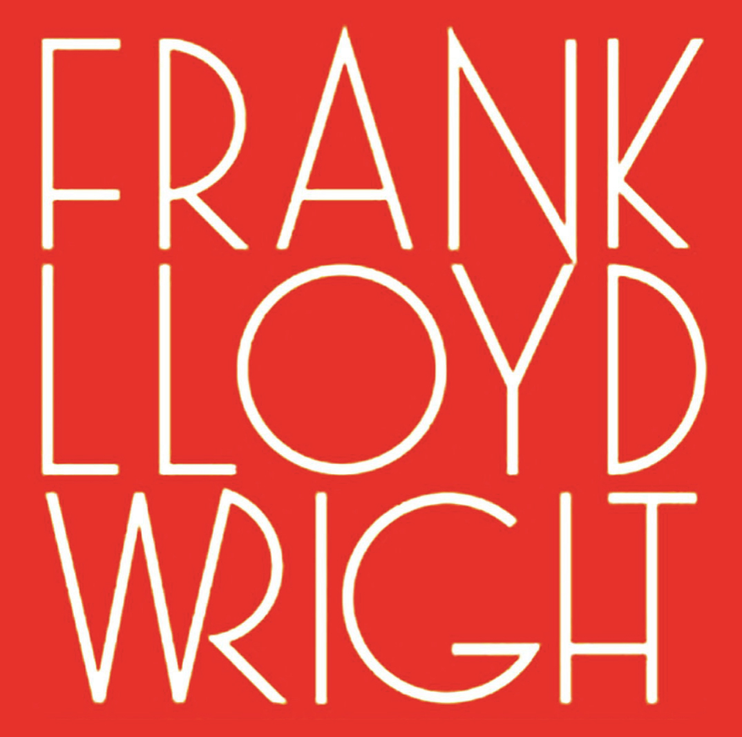
Not all letters are created equal. Anyone who’s tried to create a beautiful monogram knows this. But c, w, and x, especially together, are a graphic designer’s dream. The final form’s rounds, squares, and triangles create a powerful and energetic state. The hand-lettered CWX monogram is a tip of the hat to Frank Lloyd Wright’s signature on his plans.
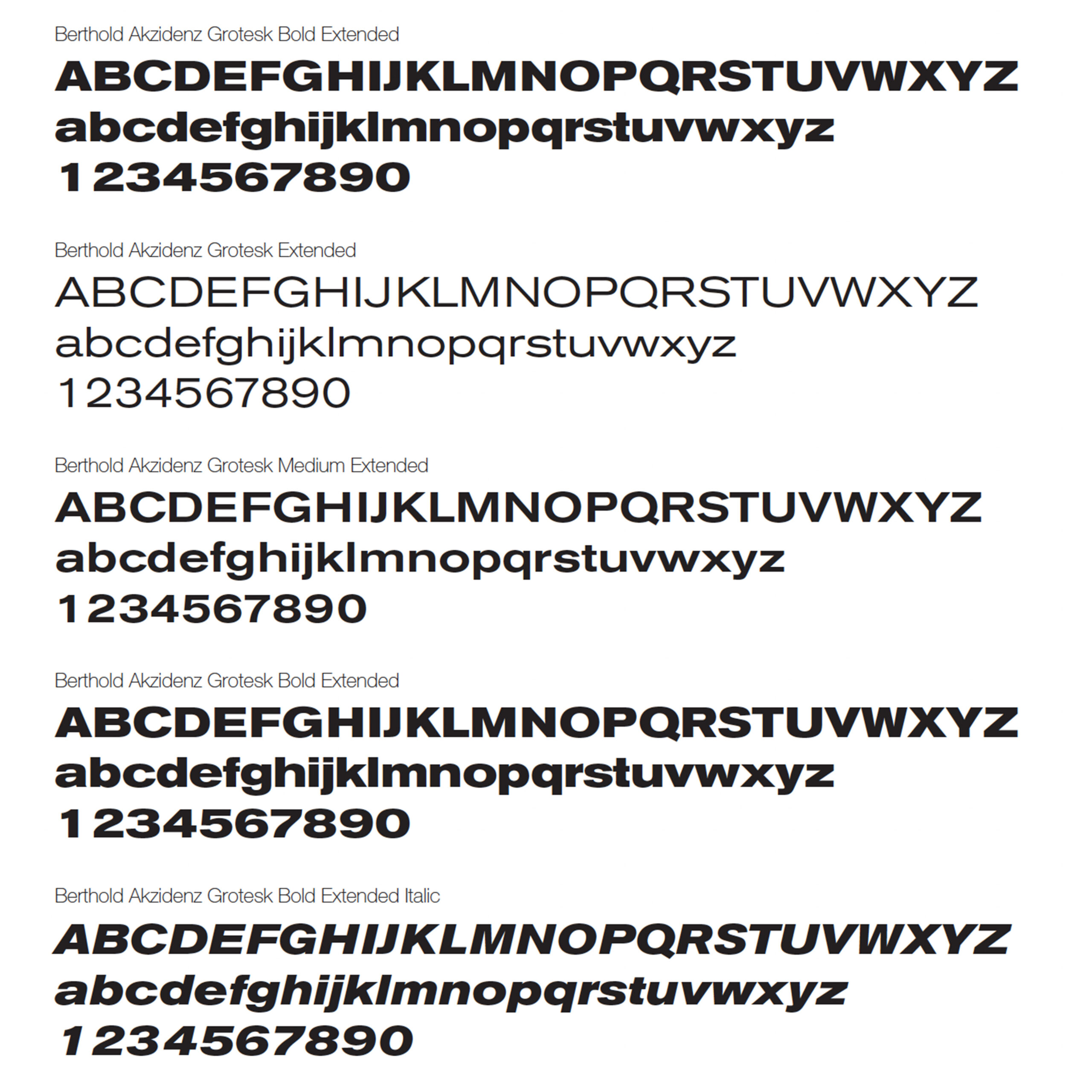
Our choice in supporting typography, Berthold Akzidenz Grotesk, has its roots in a small mid-century type house. It ain’t Helvetica! Everyone struggles with proposal covers and other business communications. By making the type big and bold we can fill a page with an impactful memory that still points directly to the brand.
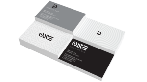
Favorite Details: Carlin and his team understand that the project starts with the first impression. In a clever callback to their brand pillar, Details, their collateral uses genuine silver ink (not gray) and spot color red. This is a purposeful choice for the contrast it creates with the luxurious cotton paper and a throwback to an age of quality materials and craftsmanship. Their business cards are expensive, but they create an undeniable first impression to anyone who thinks they’re just another little architecture firm.
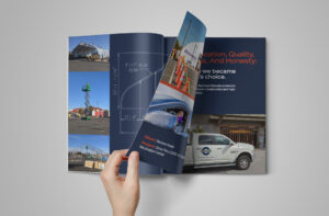
Logo design, brand identity, signage, and vehicle decals for Curtis Bros. Construction Inc.

At the intersection of purpose and play is this one-man-band who knows the power that fulfilling spaces can have. Oh, and gradients.
We took Northern Nevada’s leading architectural firm and rebranded it with a bold, thoughtful identity founded on the idea of connection.