“I couldn’t be happier with the new brand and implementation from the Foundation team. They understood our situation to capitalize on some unique opportunities and created something that respects our history, but also positions us for future success. Their work has given us a competitive advantage in our market.”
David Mansfield, CEO, Curtis Bros. Construction
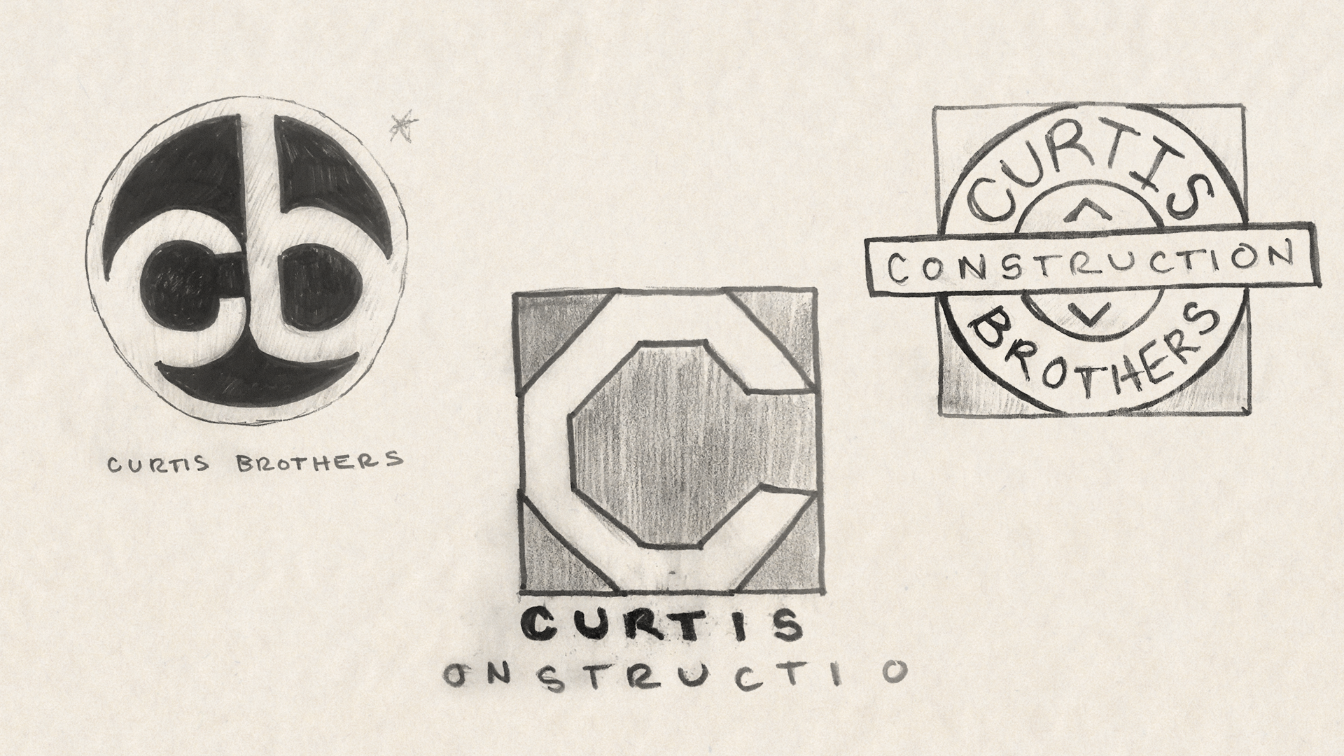
Objectives: To reposition Curtis Brothers Construction from a small-scale specialist to a large-scale generalist firm. Use brand development to reinvigorate employees and to reintroduce Curtis to the marketplace.
Design Thinking: We used our proprietary Vision and Brand Pillars workshop to gather the information we needed to start brand development.
Solution: Curtis Brothers Construction is less about the brothers in partnership than they were in the past. We downplayed the brothers and created a transitional visual that focused on Curtis. In addition to brand development, we spent extra time making sure the new visual identity was unique to the industry so Curtis stands out from the crowd at the job site. Job site presence and a team feel are key to looking and feeling like a big brand. The more colloquial CURTIS exhibits a big brand swagger and an “of course you’ve heard of us” feel.
Challenges: The owner David Mansfield and our principal Stan Byers have known each other for over thirty years. While David gave us carte blanc, the pressure to do great work was magnified by that responsibility.
Visual Influences? The NFL (Team Sports). We’ve learned that if the crew doesn’t like their shirts (equipment) they are less likely to take care of them and wear them with pride.
Favorite Details: Curtis Bros. takes its quality and deadlines seriously and has developed a reputation as the firm that gets things done. Their reputation is handily summed up in their tagline: Consider it done!
Another favorite detail? It’s not often a color like Safety Orange is a viable choice, but here it contrasts nicely with the more subdued colors of the logotype. Bonus: no need for high-vis vests when it’s already part of the uniform.
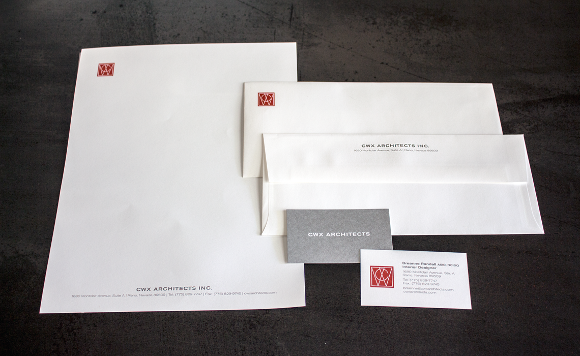
This pioneering custom home builder was known throughout the area for the artistry and craft present in all their homes. We gave them a brand that backed it up.
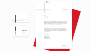
Leaning into the sweet spot between “heritage” and “contemporary”, this small-but-mighty firm discovers their love for legacy and community.
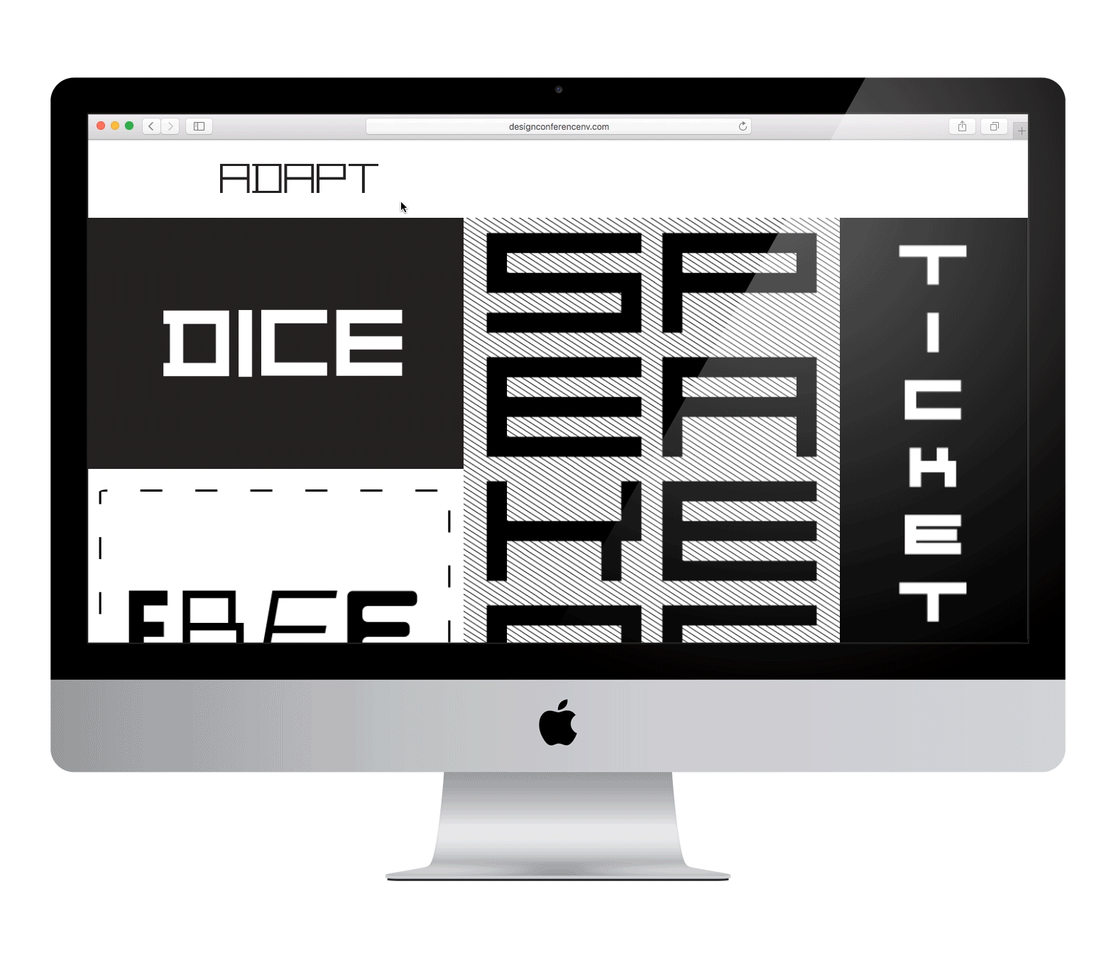
Northern Nevada’s premier multidisciplinary design conference gets a dynamic brand centered around a custom typeface that embodies what it means to Adapt.