Co-Founders Dave Clark and Bernard “B.J.” Sullivan originally established Clark/Sullivan Construction in 1981 after the duo purchased CHS Construction, of which both Sullivan and Clark had been previously employed.
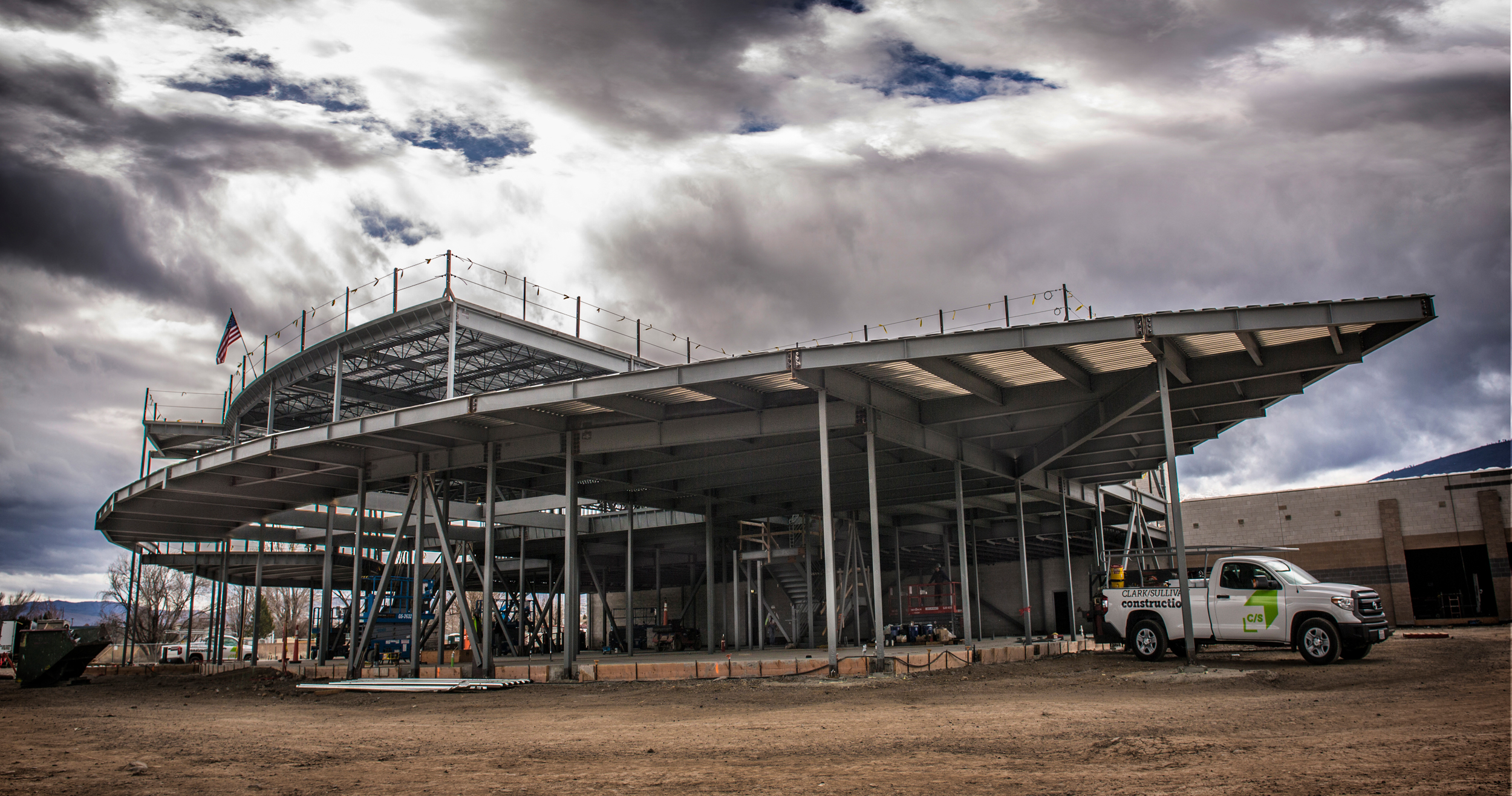
The company eventually grew into a regional leader, holding offices in Nevada, California, and Wyoming at the time of our collaboration. Their portfolio includes public facilities, educational institutions, hospitality, healthcare, industrial, and commercial buildings. Within Nevada, they’re well-known for building some of the area’s most iconic structures, including Renown Health’s Tahoe Tower expansion and the Nevada Museum of Art.
Objectives: We see so many brand development projects that start as the symptom of rapid growth. As the Clark/Sullivan portfolio filled with higher profile jobs and their number of offices expanded, the brand fragmented into several different logos spanning decades of operation. It wasn’t unheard of to find their original logo from the 80’s on a jobsite hardhat. New faces in the company were never given the formal brand introduction and simply didn’t know what was right or wrong. To cap it off, founder B.J. Sullivan was seeking a smooth transition of ownership to secure his retirement.
Design Thinking: We started with insightOUT™, an all-day brand discovery session with nearly 15 high-ranking staff members, including B.J. himself. In this session, we noticed what really got the group fired up wasn’t so much the structures they built, but the people behind the scenes. The firm truly valued the partnerships they had built over the years and knew their most respected work came from their most respected clients. What they didn’t know was that you could build a brand around that idea.
Too many regional-sized construction companies focus on so many faceless benefits to their work. They talk about the product, about the budgets, about the speed. What they don’t talk about is the people you’ll work with if you hire them, and so we knew this was a bold, unique stance for Clark/Sullivan to claim.
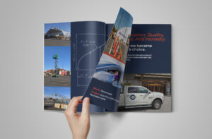
Solutions: Although it’s a relatively fresh perspective for this sector, people-forward branding isn’t necessarily new to the rest of the business world. We really loved the word “partner” because it felt distinct enough to claim, but also because it implies shared success. As “The partner to build with,” Clark/Sullivan create a brand promise of collaboration and tailoring their services to a client’s needs.
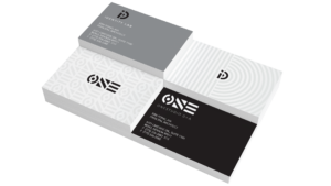
“Clark and Sullivan” is a wieldy name to work with, so we experimented with various ways to truncate it, eventually landing on a backslash. Immediately, this takes a company name about two people and creates an ambiguous single name to represent the firm. The backslash also carries over into the icon abbreviation C/S, which creates space for the brand to expand in the future without either the “Clark” or “Sullivan” present in the company.
Challenges: Wrangling various offices and project teams to align with a new set of guidelines isn’t easy – the company proved that the first time around. This time, we formally announced the rebrand with a company event and had leadership from each of the offices express support for the new direction to employees at all levels. Involving entry and junior level staff members is a great way to garner support. Feeding them a slice of cake doesn’t hurt, either.
Favorite details: The obvious detail is the upward pointing arrow present in the icon. What might be less obvious is the thin right angle that creates a 3-dimensional building block stamped on the top with C/S. The strong stable elements lend themselves beautifully to patterns and other parts of the design system. More importantly, they’re a visual representation of Clark/Sullivan’s promise of a successful partnership.
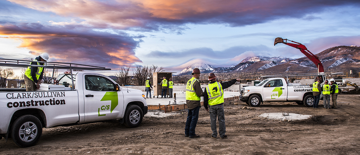
Visual influences: Back in the day, Co-Founders Dave Clark and B.J. Sullivan painted their first fleet of trucks a pretty aggressive shade of raspberry. The Northern Nevada sun had other plans, though, and eventually faded them to an unforgettable pink that the company became known for.
With this in mind, we knew we didn’t have to play it safe with color choices. Ironically, that meant taking a leap with a sizzling “safety green.” We crafted something that would stand out on a job site and make this next fleet just as recognizable. The client wholeheartedly agreed.
Time constraints: 3 mons.
Specific demands: Make the new brand partner and future proof
Anything new: Focus on the people and partnerships rather than the products
Alternative approach: We were able to create a toolkit of base designs for the in-house marketing team using Adobe Creative Cloud.
Logo design, brand identity, signage, and vehicle decals for Curtis Bros. Construction Inc.

At the intersection of purpose and play is this one-man-band who knows the power that fulfilling spaces can have. Oh, and gradients.
We took Northern Nevada’s leading architectural firm and rebranded it with a bold, thoughtful identity founded on the idea of connection.