Background: DICE is a regional conference for architecture and design hosted annually at the Nevada Museum of Art. The conference serves as a platform for all design disciplines and how they improve our future. Featuring industry leaders as guest speakers and an annual design competition, the DICE Design Conference challenges our thinking and explores the power and potential of good design.
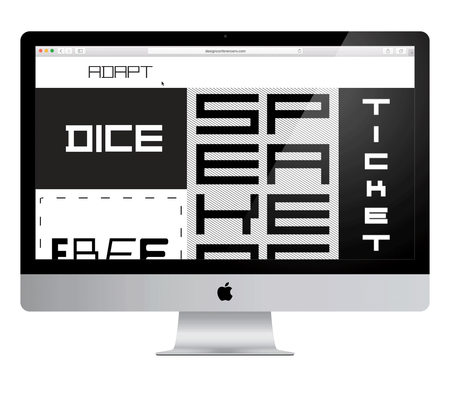
Each year DICE has a different theme based on a different design principle: play, craft, collaboration, etc. In turn, the identity of that year’s conference champions that theme. In the several years of designing the conference’s identity, 2016’s ADAPT has always stood out to us.
Objectives: DICE 2016 asked attendees and guest speakers to consider how we “adapt” the way we work and the solutions we present in an ever-changing business environment. We took this challenge to heart ourselves as designers for the event. How could we present an event identity founded on fluidity, something lacking a defined shape, yet solid enough to fulfill its purpose?
No matter what, we knew it had to look awesome. The audience were all designers themselves. Some of them, like keynote speaker, Karen Hibma, were the best in the game and idols of ours. It was time to flex our guns a little.
Design Thinking: To pull something like this off, we needed to have tons of control over the identity. The end result in our minds was a distinct amount of organized chaos, but it would take a lot of rigid disciplines to get there and do it right.
One of the best ways to do just that is a custom typeface. Type is a design element that, quite literally, touches every piece of communication both physical and digital. By making something unique to the event’s theme, we had something own-able and distinct for the event itself.
As we developed our typeface further, we realized it had potential far beyond just cool looking fonts on posters and invite materials. It quickly became the solution for the entire event identity itself.
Solutions: In partnership with our friends at Design Concern, we built an infinitely adaptable new typeface aptly called ADAPType.
ADAPType was built to be more than a typeface. It’s a modern geometric font family that evolves and expands on the single alphabet theory and rectangular-based design of the typeface’s predecessor. That’s a really fancy way of saying it pushes the limits of what a font family is defined as.
In all, ADAPType (in the hands of a good designer) is powerful enough to be the backbone of the entire design system, not just a buried component of an individual piece.
Challenges: Sure, creating your own typeface affords you a lot of control. But carrying it into web or the physical world forces you to relinquish a lot of what you spent so much time trying to gain.
If we wanted to create a flexible website that showcased ADAPType, we had two routes: spend a lot of time and money custom coding something from the ground up, or get crafty. A regional design conference like this has about the budget you’d expect, so we got crafty and created the website out of sliding panels that mimicked ADAPType’s behavior.
Favorite Details: All of the above. The type itself lends itself to so many delightful surprises in various layouts. It can create a perfect grid for a poster, extend a few words across multiple pages, and make well-known quotes feel fresh and new.
We can never thank the guest speakers enough, but we always try. For ADAPT, we had Reno staple Signs By Tomorrow create handheld acrylic letters of each speaker’s initials in their name. Bonus: they’re just wide enough to stand up on their own, so they’re perfect for displaying in an office or at home.
“I loved the conceptual nature of the design work for the conference, especially the website. I had never seen design do that, so I hired Stan and his team to do mine.”
Todd Copenhaver, Copenhaver Architecture
Anything Else: Working with DICE allows us to collaborate with both AIA and AIGA members, but also the great people they bring to speak. We’ve been lucky enough to work alongside design legends like Steven Frickholm, Aaron Draplin, and Karen Hibma.
But the big plus has to be designing for the audience. We know they’re a group of architects and designers, and that gives us so much creative freedom from the get-go. It’s a big reason why we started Foundation, to do more work for the people more likely to appreciate it.
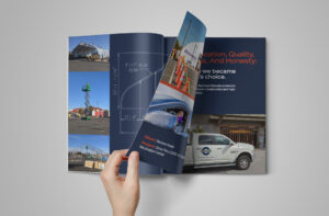
Logo design, brand identity, signage, and vehicle decals for Curtis Bros. Construction Inc.

At the intersection of purpose and play is this one-man-band who knows the power that fulfilling spaces can have. Oh, and gradients.
We took Northern Nevada’s leading architectural firm and rebranded it with a bold, thoughtful identity founded on the idea of connection.