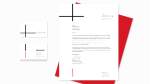
Brand development, naming, visual identity, website, stationery, and signage for one of Reno’s oldest and most historic structures, now repurposed as a retail and business space.
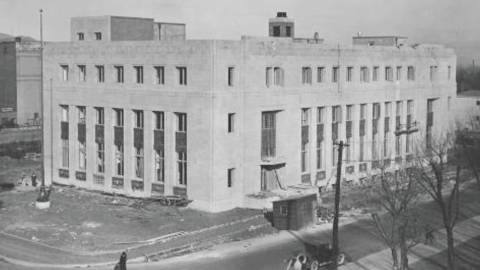
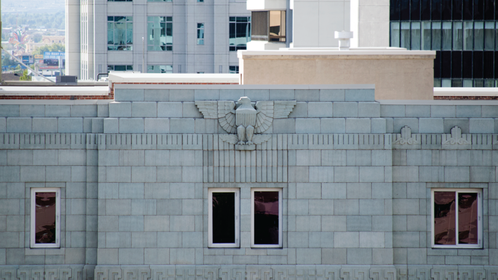
Fifty South Virginia is a reimagined retail and business workspace in the heart of downtown Reno, Nevada. Formerly the Reno-Main Post Office, it was designed in Art Deco Moderne style by Nevada’s preeminent architect, Frederic J. DeLongchamps, and was listed in the National Register of Historic Places in 1990.
“It very was important to us that we stayed true to the rich history of the building. The Foundation team took the task to heart and went beyond our expectations.”
Background: The client brought us in early in the development of the project and we got to act as part design firm——part archeologist. There was quite a bit of documentation of the building’s vast history, but nothing replaced numerous site visits and poking around.
Philosophy: Many designers (put their egos first to make a name for themselves and) bring another worn-out variation of their personal style to the table. We like to think of ourselves as a conduit. “What is going to help express this brand without corrupting its purest form?” It was very important to us to honor the original design roots without being kitschy or trite. When we were done we’d hope that the DeLongchamps would approve?
Anything else? The logo is based on a found object ornament and the supporting typography is a dead-ringer for some of the original signage. Our execution brings a contemporary feel to the brand.
Favorite Detail: This project is a true designer’s visual delight but our favorite piece may be the tagline: ”Make your place in history.“ a true clarion call to the curious business considering renting space.
Challenges: This project followed a swift timeline and was completed in 10 weeks. We had the website up and running for a very important business inquiry that went well for the client. WTF dude?
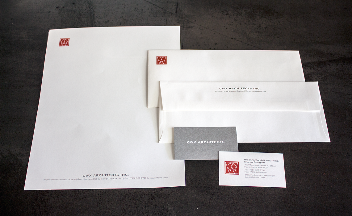
This pioneering custom home builder was known throughout the area for the artistry and craft present in all their homes. We gave them a brand that backed it up.
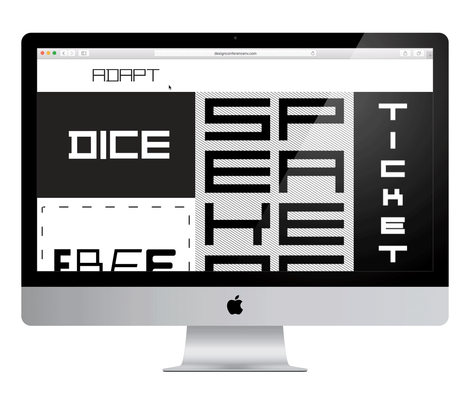
Northern Nevada’s premier multidisciplinary design conference gets a dynamic brand centered around a custom typeface that embodies what it means to Adapt.